How to Design a Custom Patch
Most patch designs go wrong in the same order. Here is the sequence that avoids it, starting with the one decision everything else depends on.
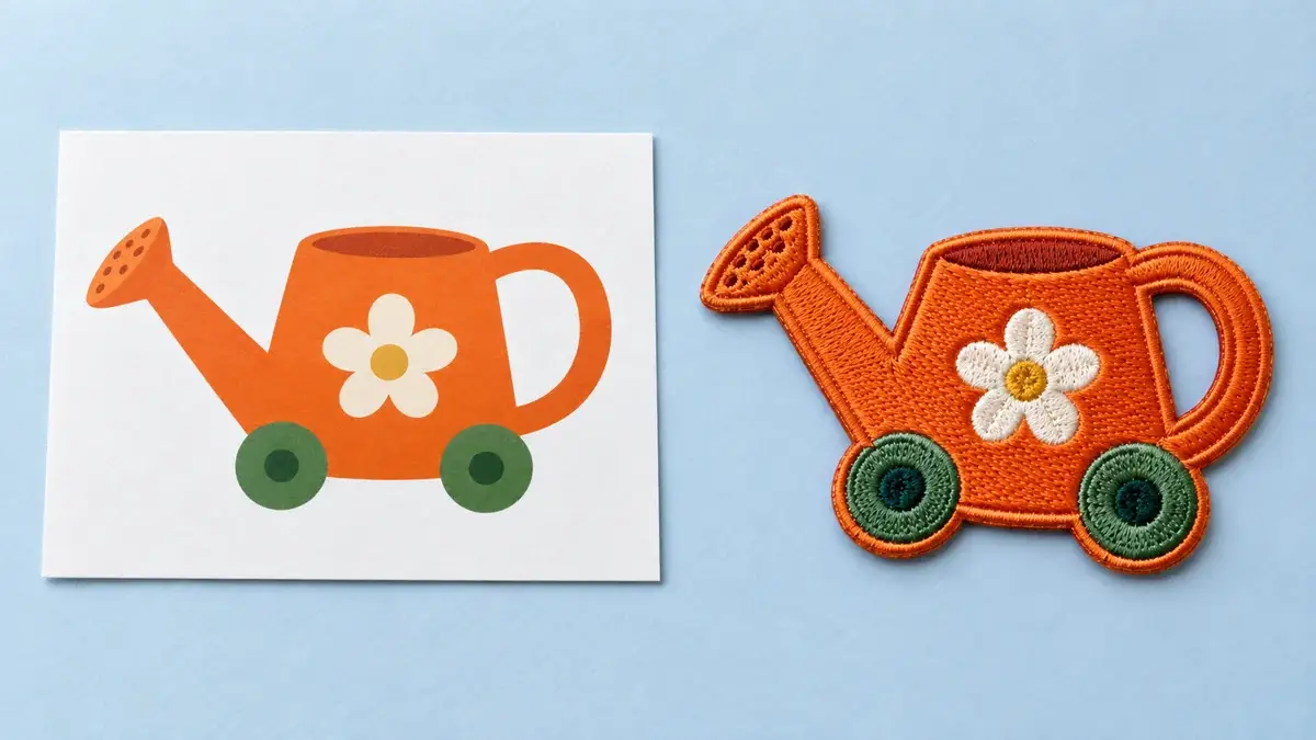
AT A GLANCE: KEY TAKEAWAYS
- Decide the finished size first. Every other decision depends on it and none of them can be made without it.
- Design for the smallest element, because that is what fails and it is what picks your construction.
- Simplify deliberately at the design stage rather than having it happen to you at proof stage.
- Rough artwork is genuinely fine. Vector conversion and digitizing are included with a patch order.
- The proof is the last point where changes are free. Read it properly.
Patch designs fail in a predictable order, and almost every failure traces back to the same mistake: the design was finished before anyone decided how big it would be.
A logo that works beautifully at any size on a screen has to become a physical object of a fixed size, made by a process with real limits. The sequence below runs those decisions in the order that avoids rework.
1. Decide the finished size
Not roughly. Actually.
Size comes from the garment, not the design. Measure the flat area the patch has to occupy on the item it is going on, at the size most of your run will be. A cap front, a shirt chest, a jacket back and a gear loop field all give you different room, and a patch cut for one will not sit right on another.
Two techniques cover almost everything. On a flat panel, measure between the seams rather than edge to edge. On a curved surface such as a cap front, measure the chord across the middle rather than the width at the base, because a curved panel narrows as it rises and a patch sized to the widest point lifts at its corners.
Everything below depends on this number.
2. Find the smallest element
Look at your artwork and identify the single smallest thing in it that has to remain readable. A tagline. A founding year. A thin outline. A registered mark. A city name around a rim.
That element, at your finished size, is what decides your construction. Not the overall look, not the budget, not what you ordered last time.
Curved type is worth flagging specifically: letters get narrower as a curve tightens, so the readable minimum is not constant around a roundel or a shield. The tightest part of the curve is the part to check.
3. Match the construction to that element
With a size and a smallest element, the construction narrows quickly:
- Small type, thin rules, a lot packed into a few inches: woven. Fine flat threads hold lettering down to around 2 mm where the letterform allows.
- Bold shapes, thread texture, a traditional patch look: embroidered. It gives visible stitching and slight relief, and it closes up fine type sooner than woven does.
- Photographs, gradients, shading, high color counts: printed. Dye sublimation is the only construction that reproduces tone directly.
- A die-cut silhouette, gear, weather: molded PVC or silicone. The outline comes from the mold, so the patch can be the shape rather than art inside a border.
- Block letters at scale on a jacket: chenille, with embroidery worked over it for any detail.
- The material itself as part of the look: leather, debossed, engraved or printed.
If your smallest element and your finished size are in conflict with the construction you wanted, you have three honest options: a larger patch, fewer elements, or a different construction. Shrinking the type is not one of them.
4. Simplify on purpose
This is the step people skip, and skipping it means simplification happens to you at proof stage instead.
Work out which elements have to survive and which are decoration. Then remove or enlarge the ones that will not hold. A design with four elements that all read is better than one with nine where three are illegible.
Specific things that need attention:
Gradients. Thread and molded constructions build color from discrete areas. Gradients get rebuilt as flat color, and deciding how is a design decision. Make it yourself rather than delegating it.
Thin lines. A stitch cannot be thinner than the thread making it, and a molded line has a minimum weight of around 0.6 mm. Normalize line weights up rather than leaving them to be interpreted.
Adjacent similar colors. Two close shades meeting on a small element read as one from any distance. Give them separation, or put an outline between them.
Taglines. The most common casualty. If the tagline will not hold at your size, dropping it is usually better than shrinking everything else around it.
5. Decide the border and the backing
Both are design decisions rather than afterthoughts.
The border follows your outline. A merrow edge wraps a rounded thread border around simple shapes such as circles, ovals, shields and rectangles, because the machine travels a continuous path. A laser or hot-cut edge is cut and sealed, so it follows tight curves, thin points and die-cut logo shapes and sits flatter on the garment.
The backing follows the garment and how often the patch comes off. It is a separate decision from the material, and getting it wrong is how you end up with a permanent patch on a garment that gets reassigned.
6. Send it, then read the proof properly
Send the artwork in whatever state it exists, along with the finished size, the garment and the date you need it. Rough artwork is genuinely fine: vector conversion and embroidery digitizing are included with a patch order, and a hand redraw produces better results than an automatic trace of a low-resolution file.
Then read the proof like it matters, because it is the last point where changes are free. Check the size against your measurement, the smallest element specifically, the colors against your reference rather than your memory, the border, and the backing. Your first proof and one revision are included.
After approval, the proof becomes the reference every finished piece is checked against. That is a good reason to spend an extra day on it.
The shortest version
Measure the garment. Find the smallest element. Pick the construction that holds it. Cut what will not survive. Choose the border and backing. Send everything. Read the proof.
Six steps, in that order. Almost every patch that arrives wrong skipped one of the first two.
Frequently Asked Questions
What should I decide first when designing a patch?
Do I need professional artwork to order a patch?
How do I know if my design is too detailed?
What happens to gradients in my logo?
Can I change the design after approving the proof?
Latest Articles
View All Articles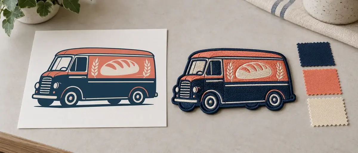
How Embroidered Patches Are Made
Six stages between a logo and a finished patch. Most of the decisions that determine how it looks are made before a single stitch goes down.
READ MORE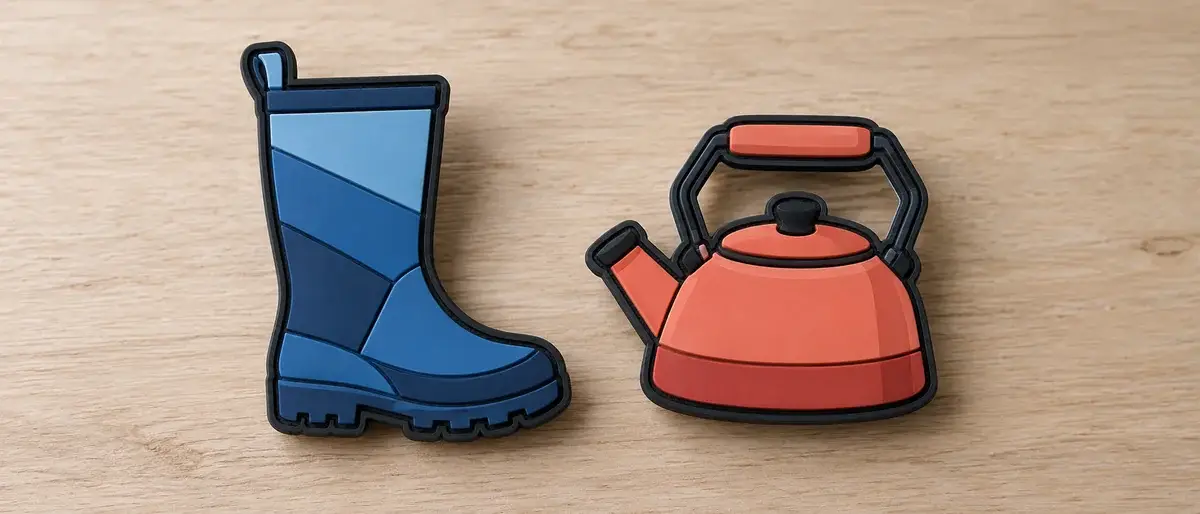
PVC, Silicone and Rubber Terms
Three words, two materials, and a lot of confusion. What people mean when they say rubber patch, and why the distinction matters once you are ordering.
READ MORE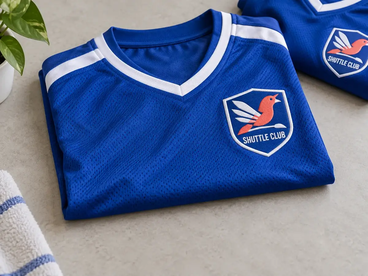
Planning Patches for a Team
A group order is mostly an administration problem wearing a design problem's clothes. Here is what to settle before you send anything.
READ MORE